
Click image to link to video
Spread and Reach: Animating the COVID-19 pandemic spread in America by day and select state spikes, 2021
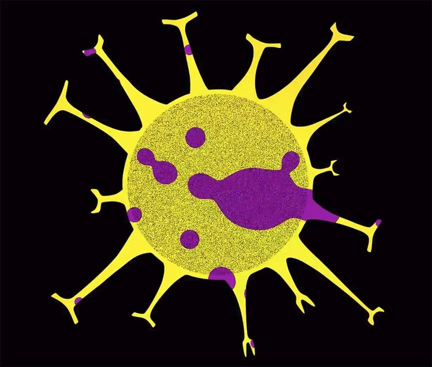
US COVID-19 data acquired from the New York Times informs the work’s shape and animation. Each protein spike of the virus drawing represents a state in which Starrett and Reiser have lived or have close relatives. Data from October 20, 2020 informs each protein spike’s shape: each length is based on the state’s cumulative number of cases; each tip, or in scientific terms, receptor binding domain width is based on the state’s number of cases; and each tip height is based on the total deaths. The represented states are listed clockwise from the top seam: Minnesota, South Carolina, California, Pennsylvania, Kansas, Florida, Massachusetts, New York, North Carolina, Tennessee, Michigan, Utah, Texas, and Missouri.
Each frame of the center animation shows daily new COVID-19 cases from January 21, 2020 to today, the blue pulsing spans 1/21/20 to the 3/10/20 lockdown after which the pulse is red until the first vaccine efficacy rate of 90% is announced on 11/09/20 when the yellow pulse appears. The animation turns fully yellow and slows January 1, 2021 and the number of those vaccinated in each state each day are illustrated by the relative sizes of the 50 magenta blobs.
The star sequence chronicles the tragically large number of people who have died due to COVID-19 and the timing of their deaths. The number of US residents lost to the virus are shown as stars—each star represents 500 people lost. The animation begins with data from 1/20/2020 when the New York Times began tracking deaths and continues through 7/13/2021 (and updated periodically).